Endeavor: Senior Designer | Case Study
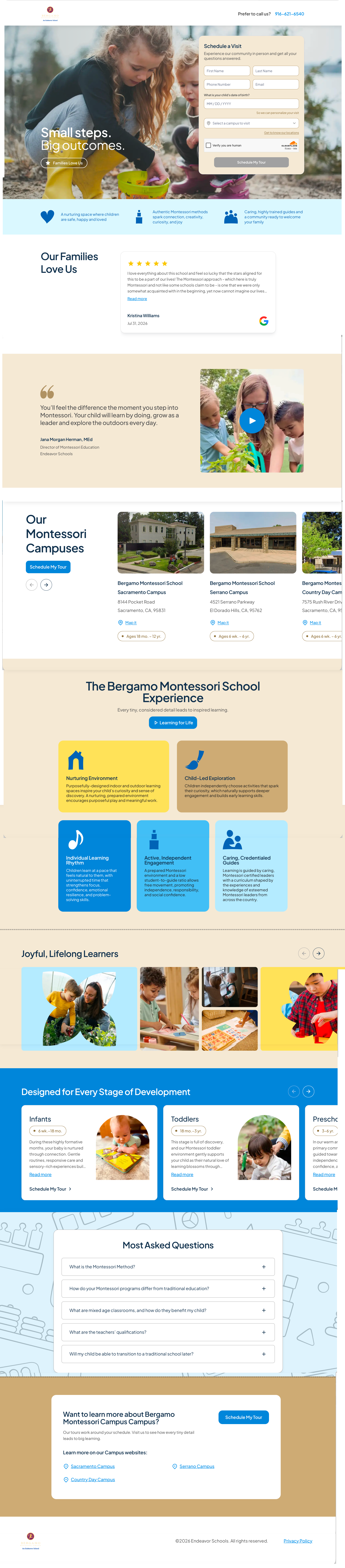
Current DesignEndeavor Senior Designer Exercise 1:
Landing Page - Bergamo Location
Recommendations to Improve Conversion, Clarity, and User Experience
1. Above the Fold
What works:
The lifestyle image feels authentic and engaging. “Small steps. Big outcomes.” is memorable, and the tour form makes the primary goal clear.
What could improve:
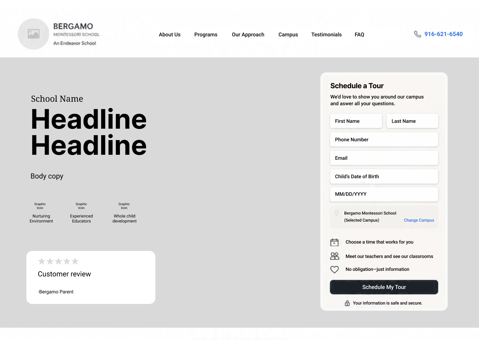
The hero needs to explain why families should choose Bergamo. Add a short value proposition highlighting the Montessori approach, age range, or key benefit. Add reassurance near the form so parents know what happens after submitting.
2. Information Hierarchy & Flow
The page asks parents to convert before giving them enough reasons to do so. I would organize the experience around:
Value → Trust → Tour
After the hero, quickly introduce 3–4 key benefits such as Montessori Learning, Experienced Educators, Nurturing Community, and Programs for Young Children. Follow with testimonials, programs, campus photography, FAQs, and another tour CTA.
Since this is a Bergamo-specific page, preselect the campus to remove an unnecessary step.
3. Trust & Reassurance
The photography is a strong trust builder, but parents need more proof before scheduling.
Bring these elements higher on the page: parent testimonials, ratings/reviews, educator experience, safety information, program ages, and real campus photography.
Turn “Families Love Us” into a meaningful proof point with an actual testimonial or rating.
4. Calls to Action
• Use one consistent CTA throughout the page, such as “Schedule a Tour.”
• Set expectations with simple supporting copy:
• Schedule your visit
Choose a convenient time to tour our school and meet our team.
Repeat the CTA after important sections instead of placing competing actions throughout the page.
5. Mobile Experience
Keep the mobile experience simple and easy to scan. Prioritize:
Headline → Value Proposition → Trust → CTA
Use full-width form fields, large tap targets, fewer required fields, and remove the campus selector when Bergamo is already known. A sticky Schedule a Tour button could keep the primary action accessible.
6. Top 5 Changes
Strengthen the hero message — Clearly communicate why Bergamo is different.
Simplify the tour form — Remove unnecessary fields and preselect the location.
Add social proof earlier — Feature a testimonial, rating, or parent quote near the hero.
Add a “Why Bergamo?” section — Highlight 3–4 easy-to-scan benefits.
Create one consistent CTA — Use Schedule a Tour throughout desktop and mobile.
Overall goal: Give parents a clear reason to choose Bergamo, build trust quickly, and make scheduling a tour feel simple.
Endeavor Senior Designer Exercise 1:
Landing Page - Bergamo Location
Wireframe Recommendation for Above the Fold
Endeavor Senior Designer Exercise 1:
Examples of landing pages that handle similar goals well
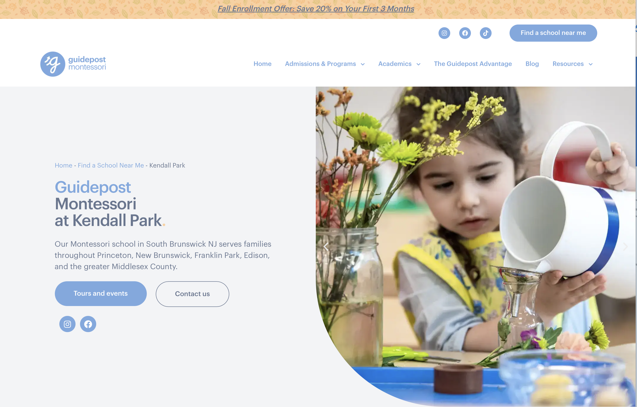
1. Guidepost Montessori
Reference for Montessori storytelling
Their location pages quickly establish the individual school, introduce the Head of School, explain what makes their Montessori approach different, and keep Book a Tour prominent. It’s a good example of combining brand story + school-specific personality + conversion
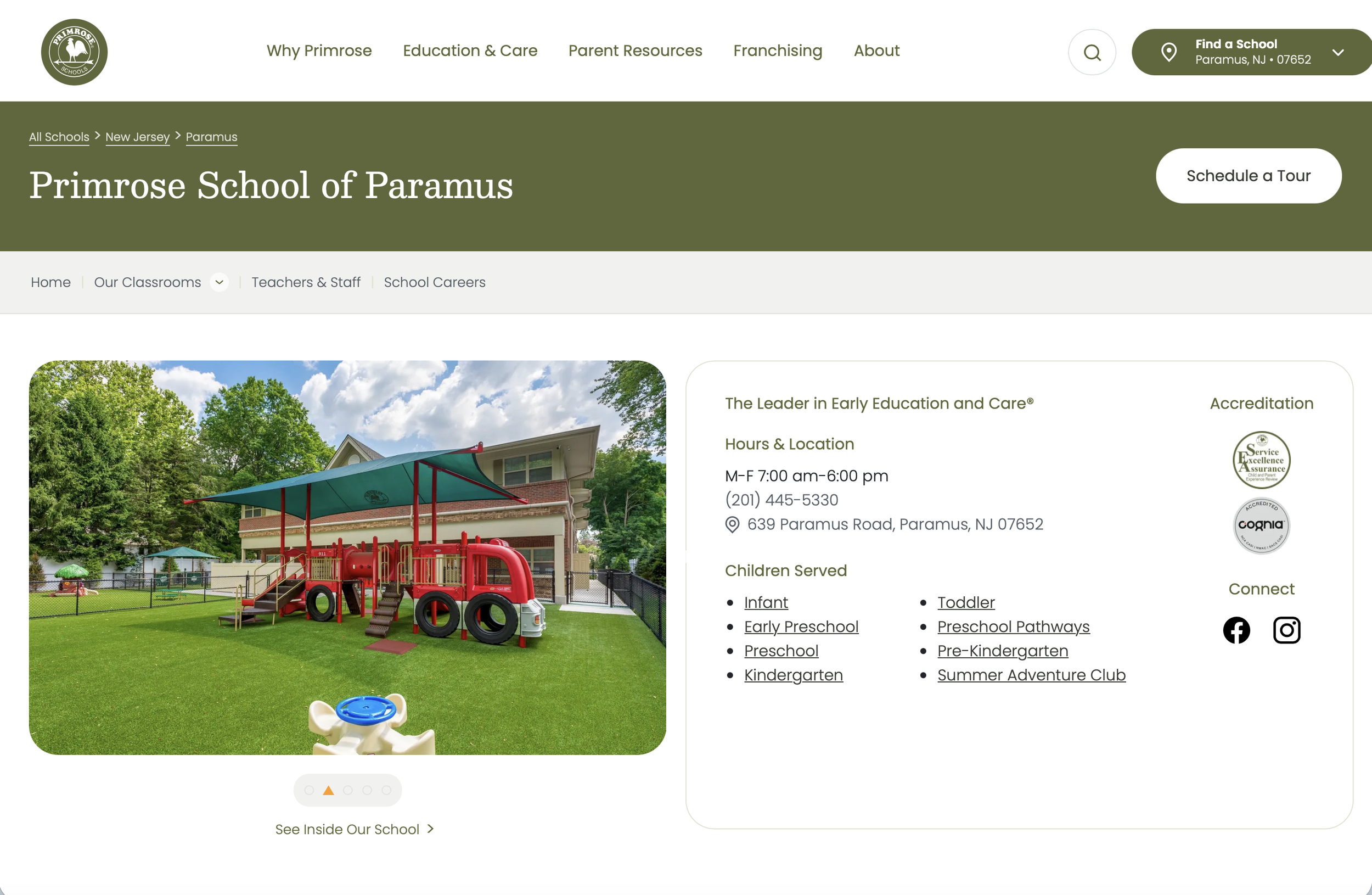
2. Primrose Schools
Reference for information hierarchy and trust
Strong at giving parents practical information immediately: location, hours, phone number, children served, accreditation, and a Schedule a Tour CTA. The page then quickly explains its educational value proposition. I’d borrow this idea of putting important decision-making information high on the page.
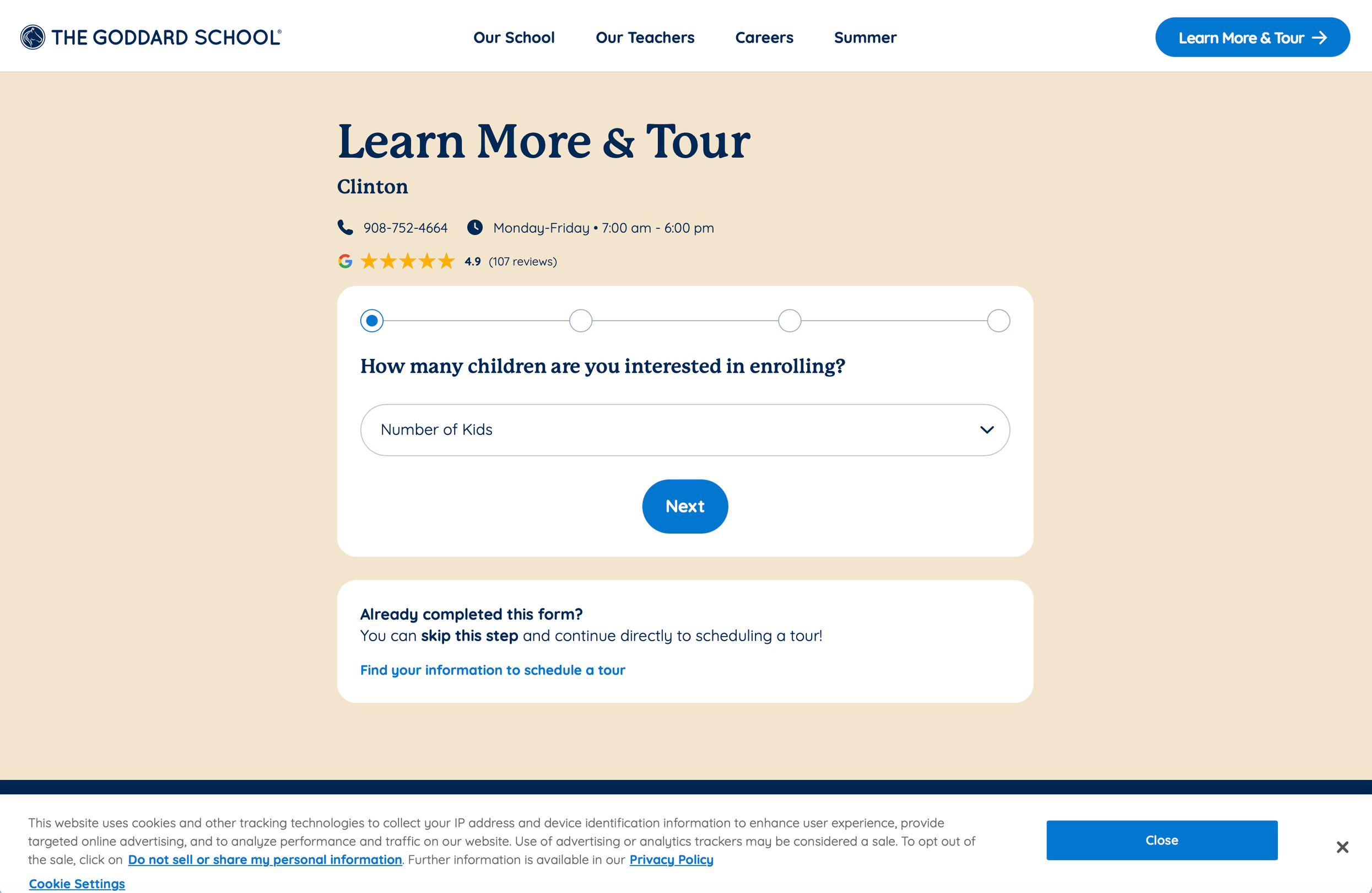
3. The Goddard School
Reference for reducing friction in the tour form
Particularly useful for studying the conversion form. Instead of presenting parents with one large form, Goddard breaks enrollment information into smaller steps. That makes a fairly complex inquiry feel more manageable and could be an interesting direction for Bergamo on mobile.
Endeavor Senior Designer Exercise 2:
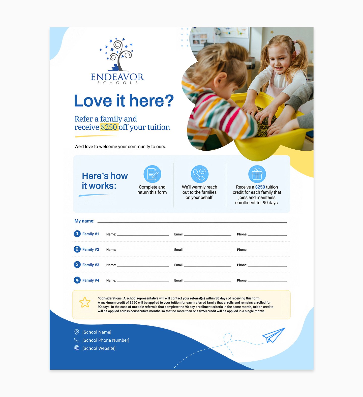
8.5” × 11“ Referral Flyer Design
• Photo and container shape can be changed as part of template design
• School name, Phone number, and website can be editable type
Endeavor Senior Designer Exercise 3:
Organic Social Post Design
Teacher Appreciation
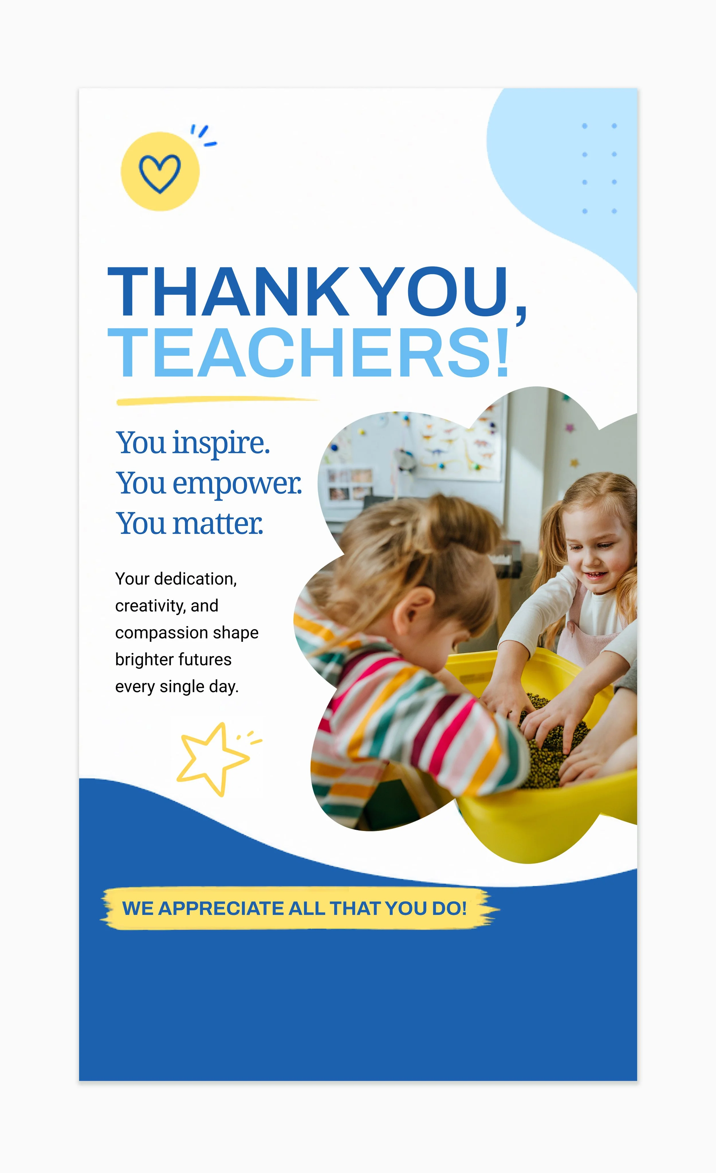
Reel Cover or Story, 9×16
• This design system can be iterated across the other two categories, Team Wins and Parent Testimonials, using different photo, container shape and copy messaging
• Graphic elements and icons can be changed
• The template can be safely reused by keeping similar word count
Endeavor Senior Designer Exercise 3:
Organic Social Post Design
Teacher Appreciation
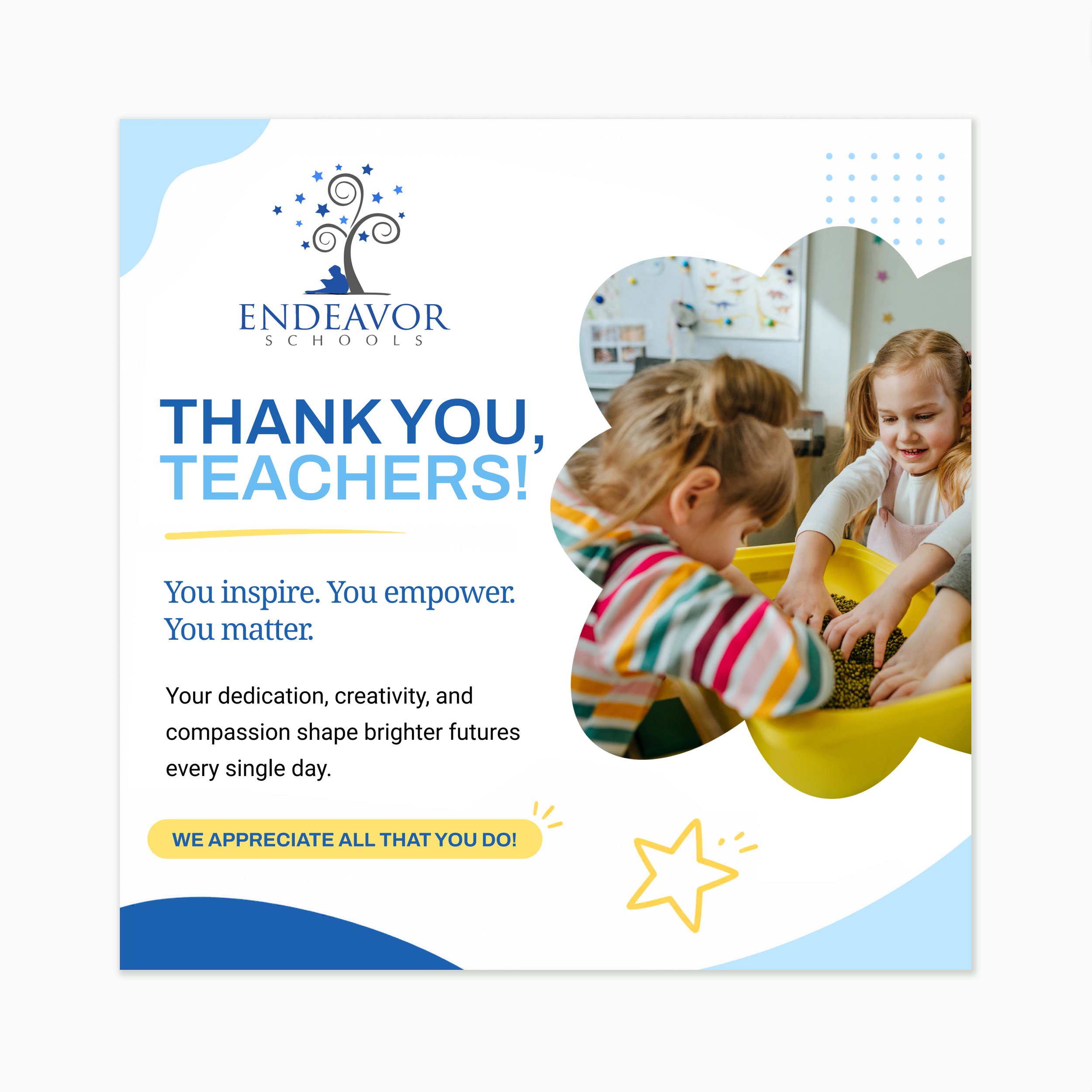
Static Feed Post, 1×1
• This design system can be iterated across the other two categories, Team Wins and Parent Testimonials, using different photo, container shape and copy messaging
• Graphic elements and icons can be changed
• The template can be safely reused by keeping similar word count